Signup Design Challenge
The prompt: Create sign-up flow for the new company, “The Club”. Do not use traditional username and password signup with alphanumeric characters, it should be a new sign-up model based purely on selecting various colors in place of characters.
I was given basic information to tackle this prompt, and communicated with stakeholders who gave me this prompt to understand more about the company “The Club”
1. Understand the Product
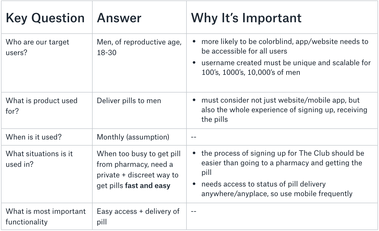
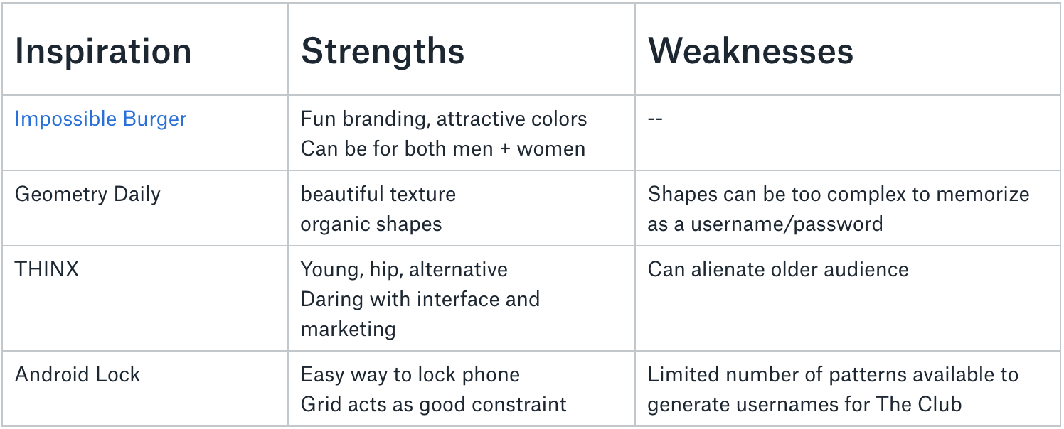
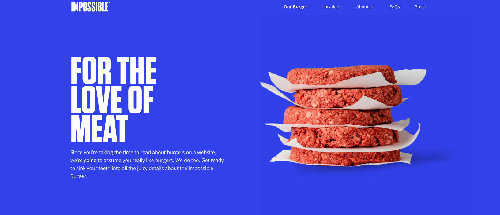
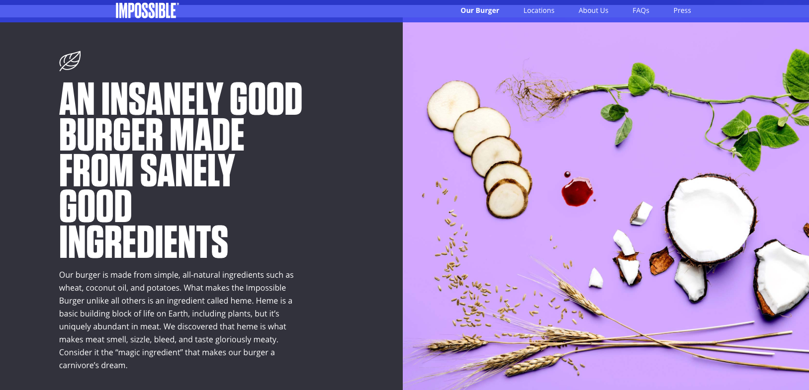
2. Research
3. Ideation
I sketched in paper and narrowed down my ideas based on these tradeoffs. The final design combines these two ideas.
Idea One
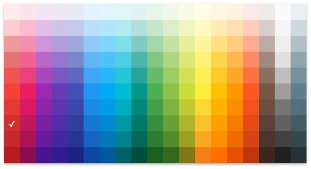
Choose username + password from a color picker
✅ many color options and combos
❌ not accessible for colorblind
❌ people don’t remember colors well, so it will be hard for them to sign back in
Idea Two
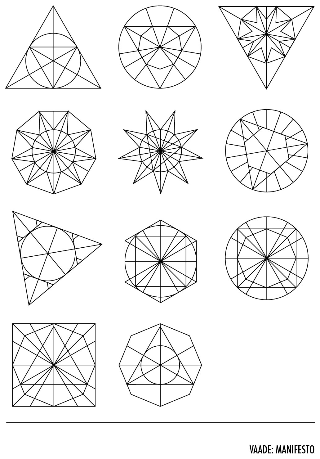
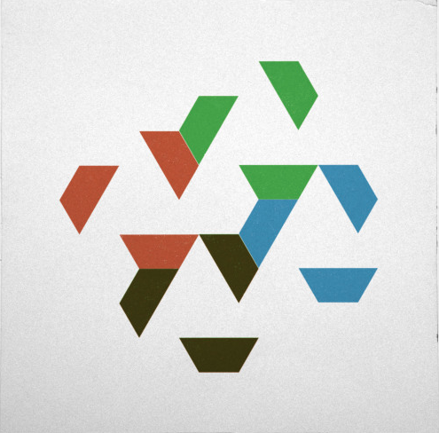
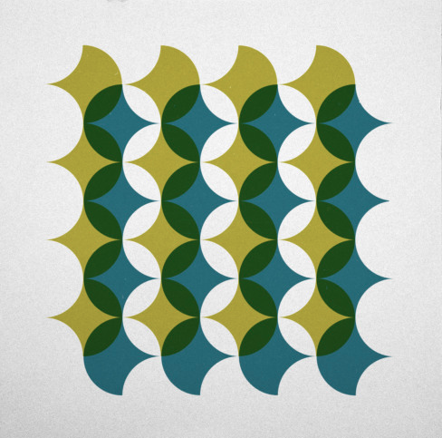
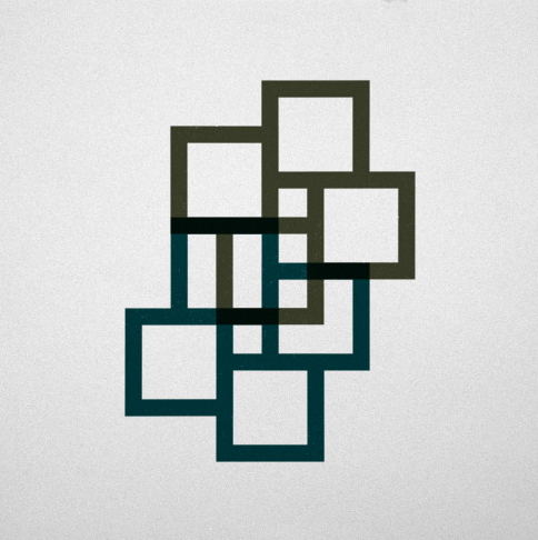
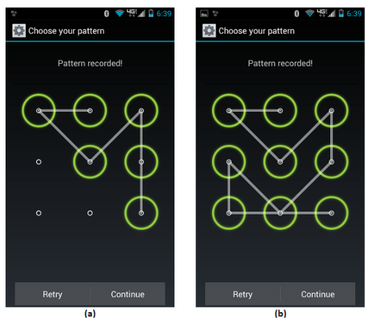
Create shapes (like from Geometry Daily inspiration)
✅ black and white is good for colorblind
❌ shapes/patterns are too complex
❌ how do you graph these shapes in a predictable manner that is repeatable?
❌ needs more constraints
4. Strategy
Persona Creation: to understand target audience while designing
User flows: understand how sign up fits in with the rest of app
Design Constraints:
Interface: Mobile first app
Brand guidelines: Convenience, trust, empowerment, etc.
Engineering time and effort
Understanding business vs. user needs
5. Design
Final idea: A delightful experience where your username and password is a piece of art created by you
✅ onboarding: lets audience know why a different sign up process is needed and what to expect
🤔 scalable but not secure: the interface asks for the full name of the user along with the creation of username. When signing back in, the name and username will be used to create a unique login that is scalable. However, this is probably not enough variation for security—and there’s a good reason why real companies don’t try this.
✅ accessible: a colorblind option (where you can choose from greyscale tones and different line weights) makes the app a good experience for everyone
✅ delightful: by combining shape and color into a username + password combination, the audience can create a unique, memorable piece of art that serves both form and function
🤔 easy to remember but hard to keep track of: shapes can only be drawn on the grid, which gives constraints and boundaries to what can be created—making signing back in easy and fun. However, it’ll be hard to keep track of and note it anywhere because it’s a shape and not alphanumerical.
*Background by Geometry Daily
Click through this prototype
6. Other Thoughts
To ship the medical item that the company offers, other information like insurance and address are also needed. This can be addressed later in the app, when users have been able to explore the website/app and figure out whether they want the service.